Streamlining Genomic Test Ordering
Flatiron Health
Balancing efficiency & consistency to enable seamless external test ordering
Flatiron Health is a healthcare technology company whose electronic medical record (EMR) software OncoEMR helps physicians at oncology practices manage care for their cancer patients. Flatiron has partnered with several genomic testing vendors to enable customers to order genomic tests for their patients directly from within OncoEMR, saving physicians time and simplifying their workflows.
At the start of 2024, we began to integrate ordering for a new vendor, Tempus, with the goal to be ready for beta launch by Q3. The team for this integration consisted of myself, a product manager, four engineers, and our clinical subject matter expert (SME). We met weekly with the Tempus team for feedback and updates.
- UI/UX design
- Interaction design
- Design strategy
- Requirements gathering
- Client management
- Figma
- Miro
- Jira
- Lead Designer (myself)
- Product Manager
- Engineering Manager
- 3 Engineers
- Clinical Subject Matter Expert

Why genomic testing?
Oncologists order genomic tests for their cancer patients for a few possible reasons:
Genomic testing results can help the physician choose a treatment that’s more likely to be effective against the patient’s cancer or less likely to have side effects.
Regardless of the vendor they order from, providers generally fill out similar types of information in the order form, with a few extra sections specific to genetic testing. This information is then sent to the testing lab to inform how they collect the patient’s sample and analyze the data.
The typical form sections a physician fills out to order a genomic test for their patient. Gray sections are always applicable, while yellow sections only apply if ordering genetic testing.
Unpacking Tempus’s data needs
To begin, I reviewed Tempus’s existing order forms and audited our completed order forms for other vendors, looking for questions and sections that closely matched Tempus’s needs.
To further digest Tempus’s requirements, my product manager and I diagrammed the various combinations of test and specimen options that the order form needed to accommodate. This exercise helped us gauge the order form’s complexity and highlight questions for the vendor. We then walked through these diagrams with Tempus to confirm our interpretations and get answers to our questions.
My audit of our existing test form integrations (left) and Tempus’s existing PDF order form (right).
My PM and I created these Miro diagrams to map out the logical requirements of the test order form, in particular the test selection and specimen options. Red diamonds represent questions for the user, while pink rectangles represent options. The blue boxes capture our main discussion points for our vendor workshop.
Balancing clarity and consistency
Before I joined, the team had already designed and built order forms for both testing types for 4 other vendors, so there were plenty of existing examples of each order form section to draw on. Tempus, however, would be our first time offering both testing types (tumor and genetic) in a single order form. As I began the design process, I recognized that I needed to balance two competing priorities:
Sprinting through Round 1
Based on Tempus’s answers to our questions and leveraging the designs for previous vendors, I quickly assembled high-fidelity mocks and walked through them with the vendor at our weekly meeting.
In the first round of mocks, I focused on the tumor testing ordering experience, which the vendor had said would account for the bulk of orders. Once the Tempus team had reviewed those, I incorporated the form sections related to genetic testing.
Pushing through the last mile
Although it felt like I was able to go from rough sketches to 90% finished designs overnight, it took much longer to resolve the last remaining design decisions before I could hand off the designs to engineering.
For each open design decision, I took a similar approach: I stated the open questions to be answered, explored a range of options that could solve it, brought the options and their tradeoffs to my team for feedback, and refined from there.
Open decision #1: Capturing the right patient diagnosis data
In the first round of mocks, the user only needed to select a single patient cancer diagnosis.
Partway through the design process, Tempus introduced a new requirement: regardless of testing type (tumor or genetic) they wanted to know all of the patient’s cancer diagnoses, as well as which of those diagnoses applied to the tumor being tested (e.g. the primary diagnosis).
In the first round of design mocks, the Disease Information section contained a single-select “Primary Diagnosis” question. The diagnosis options displayed come directly from the patient’s medical information in OncoEMR.
I brought several design options to my team for how to handle the impact to the Disease Information and Patient History of Cancer sections (below). Based on input from our clinical SME, we decided to automatically send all of the patient’s diagnoses from OncoEMR with the order submission. This would reduce complexity for users and provide the vendor the information they wanted.
In terms of form organization, the option that kept Disease Information and Patient History of Cancer separate (the clearest option from a UX standpoint) was luckily also the simplest from an engineering perspective (Option C!).
Lastly, I explored a few UI treatments for how to make it clear to users that all diagnoses would be sent by default. Based on input from my PM and clinical SME about the message’s level of criticality, we decided to go with helper text (Option 1C).
Open decision #2: Bringing clarity to test selection
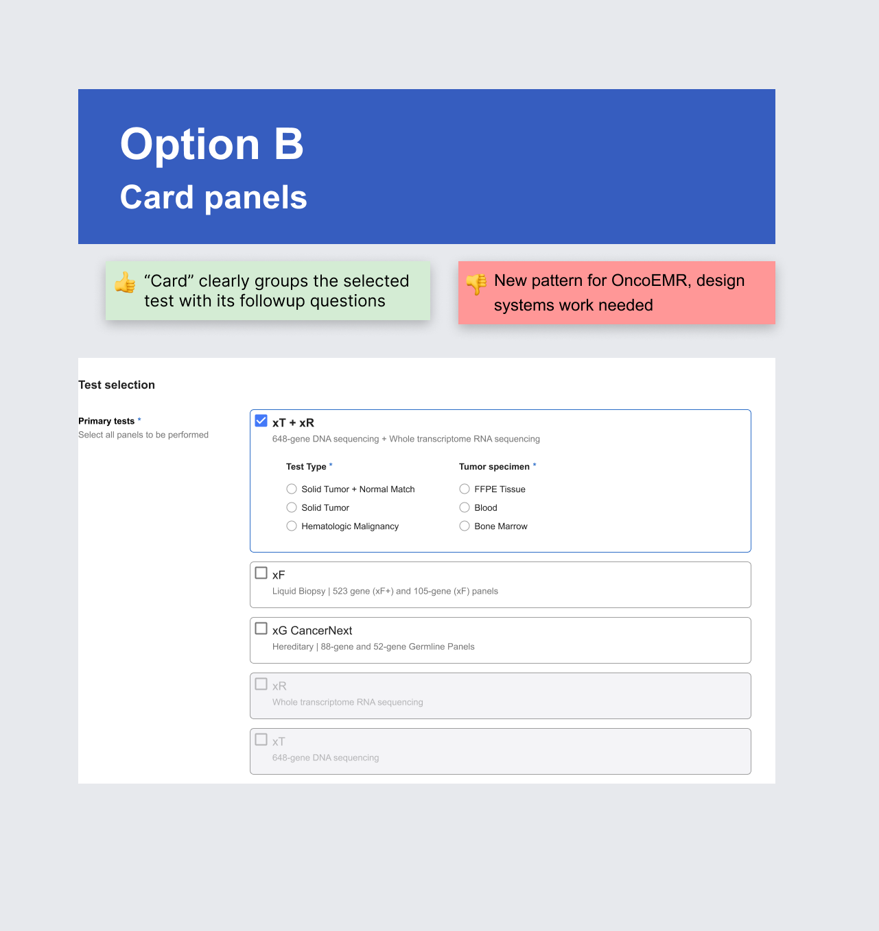
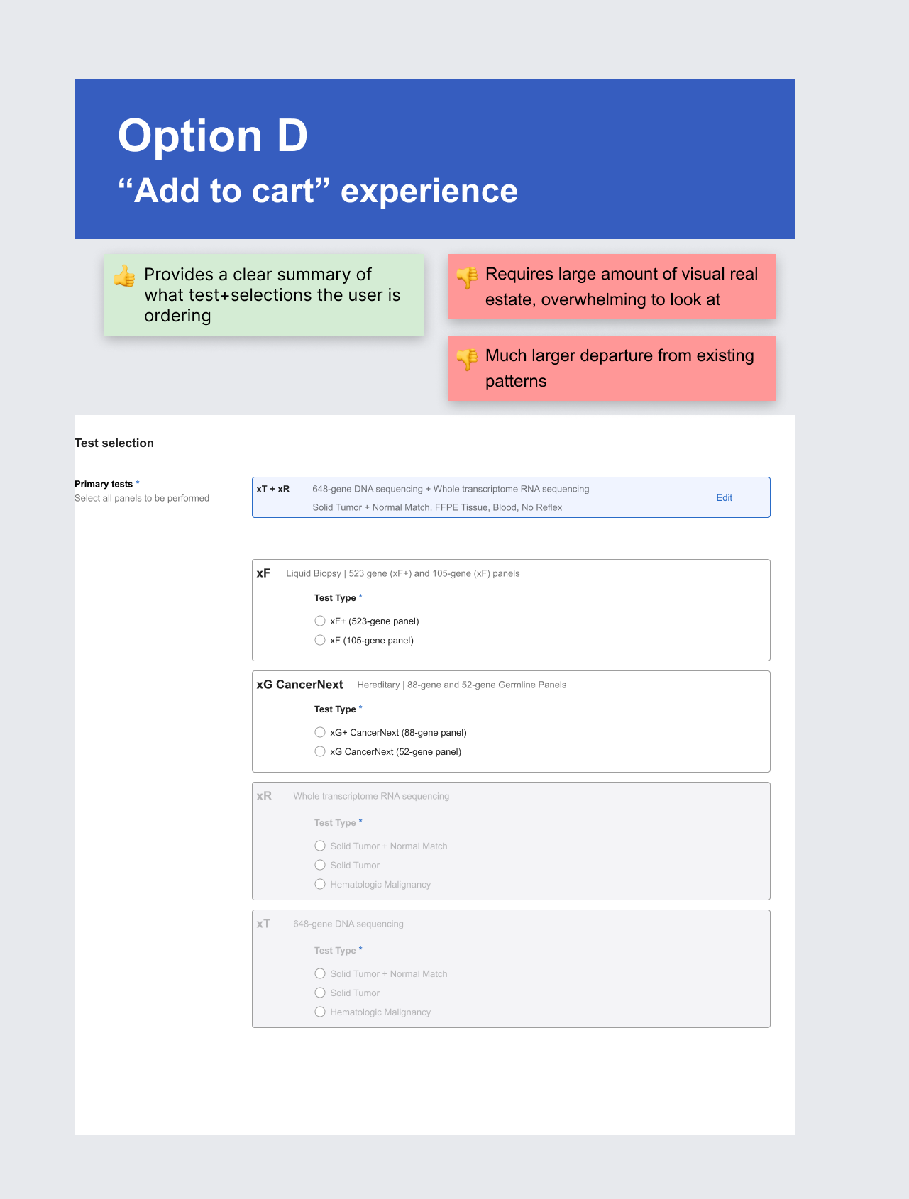
Each of Tempus’s test options has several associated followup questions, some of which only appear based on responses to previous questions. Additionally, combo and standalone test options for two tests shouldn’t be selected in combination.
From a UX standpoint, I wanted to provide a design that made these relationships visually clear to the user. Because the team didn’t have an existing component for this scenario, I started with a broad brainstorm of ways to display test selection.
I brought five options to a jam session with other Flatiron designers (above). Based on their response, I did a deeper exploration of Options B and D. At the end of this exploration, I concluded that Option D (the “add to cart” experience) was too significant a departure from the behavior of our existing forms for the problem it was solving. I then brought iterations of Option A and B to my scrum team to discuss tradeoffs from a technical and clinical perspective.
One of the questions I brought to my team for input was how to make users aware of disallowed test combinations.
After several rounds of discussion and iteration, our scrum team agreed on a path forward:
Approach 1: My preference from a design perspective and our tentative plan. However, although the engineers felt it was relatively simple, there was some uncertainty due to it being brand new.
Approach 2: A backup design that adapted an existing pattern from a different order form. If the engineers ran into issues with Approach 1 that put our timeline at risk, we could fall back on this one.
Open decision #3: Reusing patterns for Family History of Cancer
Upon reviewing the design mocks together, the engineers were reluctant to build the Family History of Cancer (FHC) section as I’d designed it because they had just finished building the FHC section for another vendor for the first time.
Could we reuse the components they had just built?
We agreed to a compromise: Because the engineers were already developing the new “expanding card” for Test Selection, which would be a prominent element of the order form, Design would find a way to repurpose the existing FHC components, since these would only be seen by the small fraction of users ordering genetic testing.
To make this happen, I explored how we could customize the Dropdown component and its placeholder text within the context of the existing components but still meet the vendor’s requirements.
By turning on the “write-in” functionality of the dropdown component and customizing the placeholder text, I found a way to balance the engineers’ desire to reuse existing components and the vendor’s request for write-in diagnoses.
Putting all the parts together
With all of these design decisions incorporated, I prepared annotated mocks for the engineers to write tickets against. Development started on time in April 2024, enabling the team to begin the scoping process for integrating another Tempus order form ahead of schedule.
The integration officially launched in November 2024, bringing a long-awaited capability to physicians using OncoEMR . Here’s the official press release:
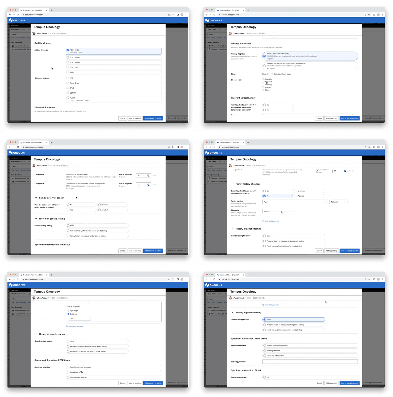
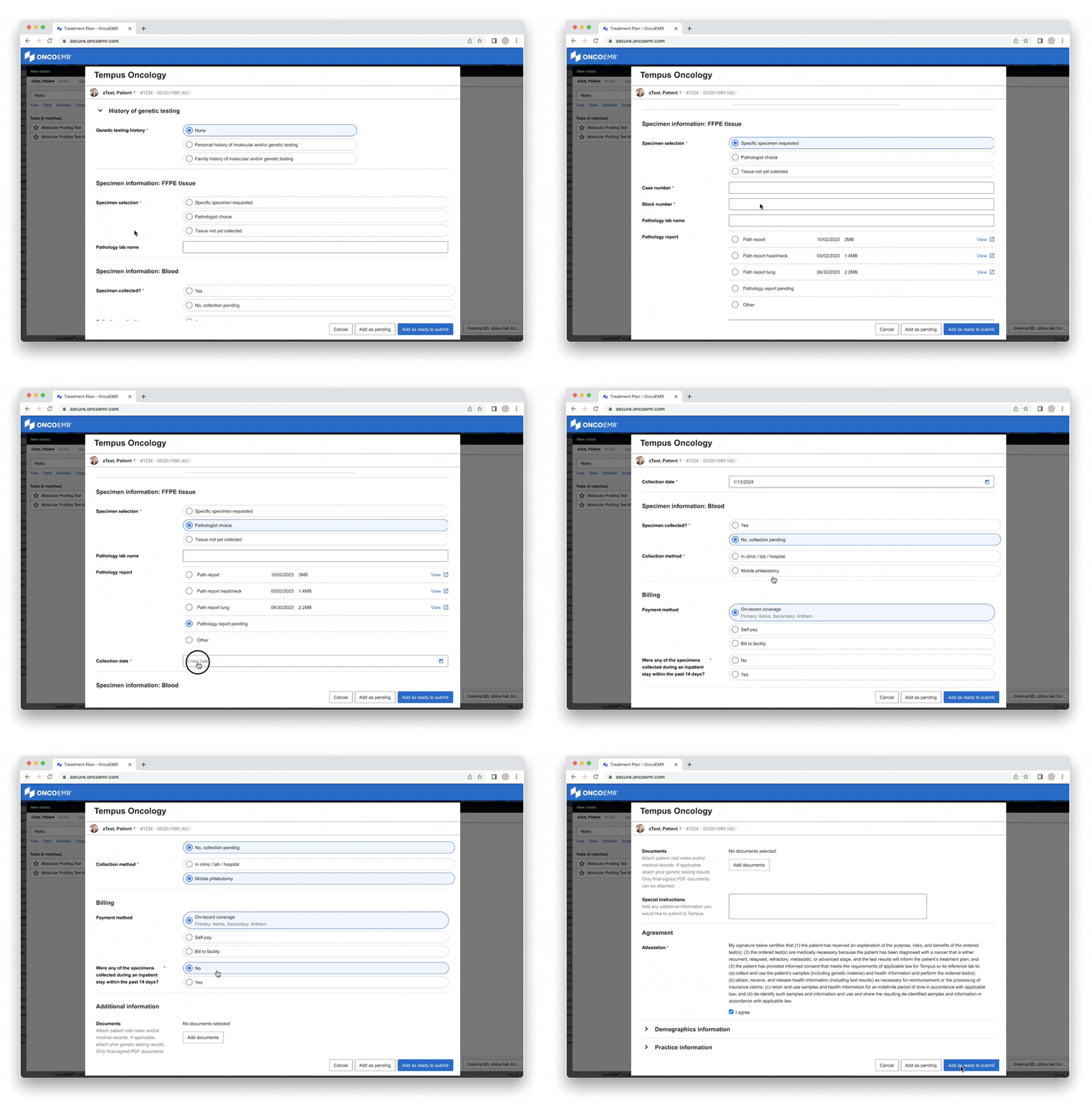
Here’s the prototype of the final experience:
Selecting tests to order
The form launches in a bare bones state because so much of the content depends on which test is being ordered.
Once the user chooses which test(s) to order, the relevant followup questions and form sections begin to populate.
Entering clinical information
The patient’s diagnoses automatically appear from elsewhere in OncoEMR, making it easy to choose the one that applies for testing.
Since the user is also ordering genetic testing in this example (xG Hereditary Testing), the relevant patient & family history sections appear. Once again, patient info is auto-populated where possible.
Sharing specimen and billing details
For each specimen type to be sent to the vendor, the user fills out details for the vendor. The patient’s insurance is autofilled from OncoEMR. Lastly, the user completes a simple attestation.
And with that, the user is ready to submit the testing order!

Make decisions once, not twice
At the start of this project, my PM and I decided to first design something that met the vendor’s requirements because we had plenty of time later in the timeline to incorporate engineering constraints. It was only when I began finalizing the designs that I realized that each tentative design decision needed to be re-decided based on engineering tradeoffs.
If we’d considered engineering and vendor input at the same time, we could have made a single decision upfront on which solution to use.
I applied this learning with the next vendor we began partnering with in Q2. Based on the first round of vendor requirements, I walked through low-fidelity wireframes with the engineers to collect their preferences. Then based on engineering’s recommendations, I updated the wireframes and highlighted proposed approaches to specific fields to bring to the vendor.


